GIS is defined as “A geographic information system (GIS) that integrates hardware, software, and data for capturing, managing, analysing, and displaying all forms of geographically referenced information.”
In a simpler form, GIS are tools that enable users to look at data in a spatial context showing how the data relates to each other by location.
Data is everything
It can reveal relationships, patterns, and trends that users may not be able to visualise from a list of numbers.
The saying goes “a picture paints a thousand words”, the same applies to data everything is somewhere whether it is a bollard, a building, or a fire extinguisher. Being able to see the location on a map enables users to see where features are about each other.
Why is GIS useful to ports?
Let's take an example; Oceanwise needs to do some maintenance on bollards across several jetties so will run a maintenance campaign. Its bollards are listed in numerical order, so if all Oceanwise looked at was the list and did them in order, this would achieve our goal but possibly not in the most efficient way.
Looking at them on a map labelled with bollard numbers shows where they are physically, and that the best use of time and resources would be to visit in a different order – 1,2,3,5,6 and 10 for example, are on the same jetty so will be done at the same time.

Sediment sampling data
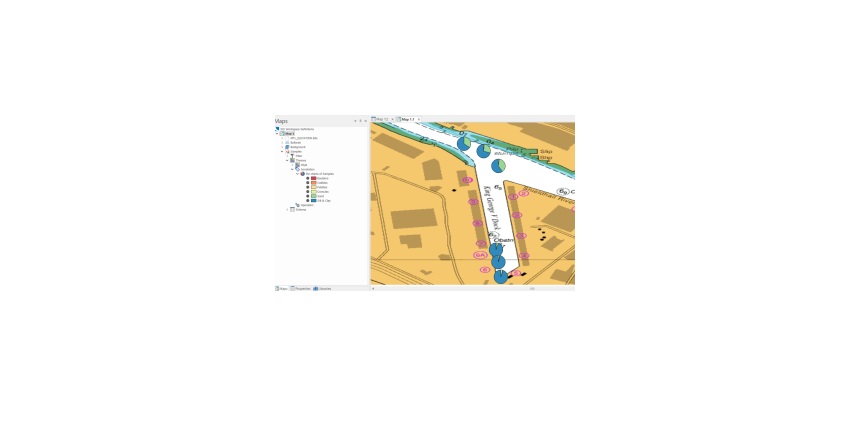
Similarly, sediment sampling data that has been collected for dredge campaigns is much easier to understand when shown in map form using pie charts
In a table, Oceanwise can see that the silt/clay and sand are the largest proportion of the sediment but it is difficult to tell just from a coordinate how they relate to each other.
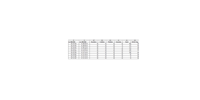
Showing the same data (directly from an Excel spreadsheet) in a map it is easy to see how the different sections of the waterway have different properties and how that may affect dredging needs
Sample collection
GIS can also help with planning. Being able to visualise where something has happened in the past can help decide where other information may need to be collected in the future if greater coverage is what is of interest.
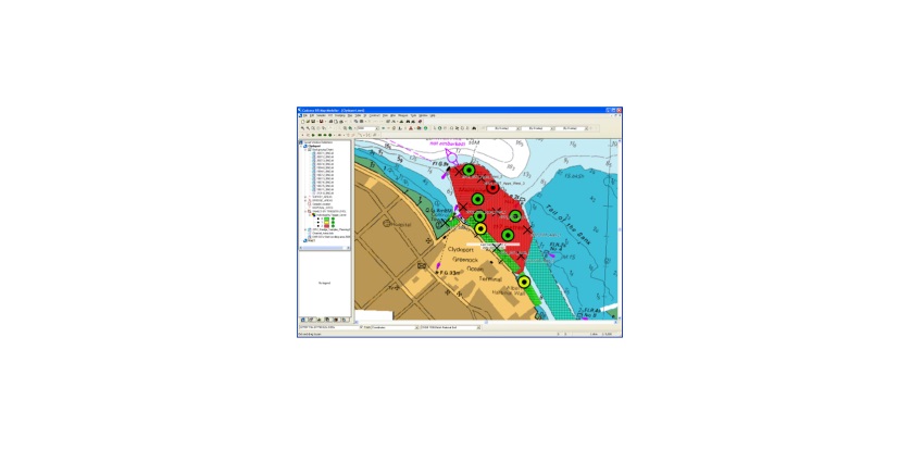
The image below shows areas of the river with circles where samples have previously been collected. The user needs to make sure samples are not being taken in the same place as before but are being collected within a specific area of the river. The GIS-enabled the user to create points on a map in between the previous samples (the crosses) and instantly get a list of coordinates to supply to the team collecting the samples.
Error identification
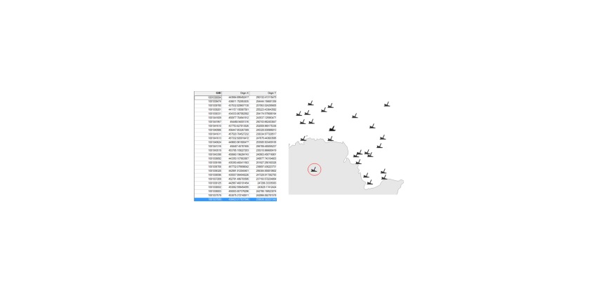
Seeing the data on a map can also help identify when there may be a potential error in the data. If the data is supplied as a list of positions, it may not be easy to see that there is an error, but on a map, it can be very obvious.
The list of features below is shipwrecks on the sea floor, one set of coordinates has a clear error – difficult to see in the list – easy to see on the map.
Summary of key benefits
- Easier to understand the data users have.
- Everything is somewhere so it can be put on a map.
- Discover relationships between data that users didn’t know existed.
- Templates and layouts to make repeated maps consistent and easy to produce.
- Don’t need to be an expert to do the basics.
- Helps data management.
- Can provide easy ways to share the data with others in a way they understand.
- Identify data errors.
How can OceanWise help?
Oceanwise has been delivering GIS Training for over 10 years and has helped many of our Port customers to get the most out of their systems. Oceanwise is a trusted source for all sorts of GIS and Data Management training and can offer introductory, intermediate, and bespoke training.
Oceanwise can help users explore how GIS might save users time and money and ensure that the data is in the right format so that it can be used in GIS. Oceanwise can also build one-off maps for projects.


